WebsitesUX/UI designCMS - Content Management SystemTechnology for businesses15 min czas czytania21 352 znaki2883 słowa
How to design a website step by step?
Learn more about Design. A practical guide with specific tips and examples. Learn best practices and avoid common mistakes.

Digital VantageYour Partner in Business, Digital Vantage Team · Digital Vantage team is a group of experienced professionals combining expertise in web development, software engineering, DevOps, UX/UI design and digital marketing. Together we carry out projects from concept to implementation - websites, e-commerce stores, dedicated applications and digital strategies.
Our team combines years of experience from technology corporations with the flexibility and immediacy of working in a smaller, close-knit structure. We work in agile methodologies, focus on transparent communication and treat each project as if it were our own business.
The strength of the team is the diversity of perspectives - from systems architecture and infrastructure, frontend and design, to SEO and content marketing strategy. As a result, the client receives a cohesive solution where technology, aesthetics and business goals go hand in hand.
Publikacja
Aktualizacja
What do you find in the article?
- Design vs. customer loss - It turns out that as many as 38% of users abandon visiting a website if its design is not attractive. On the other hand, a well-designed interface can increase conversions by up to 200%. This shows the importance of aesthetics in attracting customers.
- The difference between UX and UI - We often think of UX/UI as a visual issue, but it's more than that. User experience and user interface are two different aspects that together can significantly impact your revenue. Understanding them can be crucial to the success of your site.
- Mobile traffic - Today, about 60% of web traffic comes from mobile devices. It's not just a trend, but a necessity for your website to be responsive. What's more, responsiveness also affects Google positioning, which can have a direct impact on your online visibility.
- Elements affecting sales - CTA buttons, colors and typography are elements that can significantly affect sales results. Thoughtful placement of these elements and the right choice of color scheme can make conversions even double. This shows how important details are in design.
- Pre-launch checklist for the project - Before you start working with a designer, it's a good idea to use a practical checklist. It will save you time and money, and your project will have a solid foundation right from the start.
Introduction to web design
Try to imagine that you only have three seconds to capture the attention of a potential customer. In the online world, that's how much time a user needs to decide whether to stay on your site or leave it.
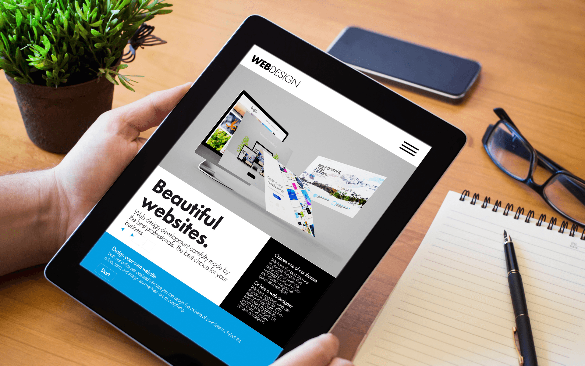
Web design is more than just choosing pretty colors and striking images. It'sthoughtful process, which can have a direct impact onthe results of your business.
Adobe research shows that up to 38% of users leave sites with unattractive design. This means that one in three potential customers may leave before they even know about your offer.
A well-designed website is an investment that pays off. Websites with thoughtful design achieve higher conversion rates. Users are more likely to make a purchase, fill out forms more often and spend more time on the site.
Design vs coding
Design is often confused with programming, although they are two separate processes. Design is the planning of how a site should look and work. Coding, on the other hand, is the stage when the design becomes a working website.
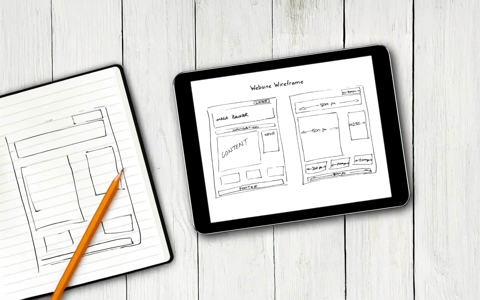
The design process includes Researching user needs, creating sketches and prototypes. It's also about testing various solutions before the programmer starts writing code.
What you'll find in this guide
We will review key aspects of design:UX and UI basics, responsiveness and conversion-oriented design. We will also discuss colors, typography and navigation.
Each topic is practical knowledge that you can apply today. You'll get concrete tips, proven solutions and learn what mistakes to avoid.
Who this guide is for
This resource was created for entrepreneurs planning a new website or refreshing their current one. If you are wondering how design can support your business goals, you are in the right place.
You don't have to be a designer to understand these principles. It's enough that you want your website to sell better and build customer trust.
UX and UI basics - the foundation of an effective website
UX and UI are two terms that are often confused with each other, although the differences between them can determine the success of your site.
What is UX and UI
UX (User Experience) is the overall user experience of using your site. It includes emotion, ease of navigating the site, and level of frustration or satisfaction. An ideal UX makes it easy for visitors to find the information they need and perform their intended actions.
UI (User Interface) is the visual layer of the interface that includes buttons, menus, forms, colors and fonts. It is with these elements that the user interacts directly.
It can be compared to driving a car: UX is comfort, ease of driving and safety, while UI is the dashboard - whether it is intuitive, easy to read and aesthetically pleasing.
Why both aspects are business critical
A website can be stunning in appearance (great UI), but if the navigation is chaotic (poor UX), it will not deliver the expected results. Similarly, a functional site (good UX) with an amateurish design (poor UI) will not inspire confidence.
The two layers must work together. The user expects both a pleasant experience and a professional appearance.
The most common mistakes of business owners
Often entrepreneurs focus solely on aesthetics. "Let it be pretty" is the typical order. Meanwhile, even the prettiest website that lacks key information, such as prices or contact, will not meet business goals.
Another mistake is designing "for yourself." Owners think: "I like it," instead of thinking: "Will my customer easily buy here?".
Learn the details of UX and UI basics in our guide:UX/UI design basics
From research to testing
A successful design process begins with understanding user needs and competitive analysis. Who is your customer? What are their needs? How do other companies deal with them?
Then we create personae - fictional but realistic images of customers. The next step is to map the customer journey, the path a user takes from learning about a problem to making a purchase.
Prototyping allows ideas to be tested before programming begins. Testing with real users reveals problems that a business owner might miss.
Although the process may seem complex, it saves time and money in the long run. It's better to correct errors at the prototype stage than to rebuild the finished site.
Responsiveness - designing for all devices
Did you know that more than 60% of users browse websites on their phones? In Poland, mobile devices have long overtaken desktop computers. If your website doesn't work properly on smartphones, you could lose a lot of potential customers.
Google rewards responsiveness
Google considers responsiveness a key ranking factor. Sites tailored for mobile devices rank better in search results. Why? Because Google strives for user satisfaction.
Lack of responsiveness can lead to poorer rankings in Google, which translates into fewer visits, fewer customers and lower profits.
Three approaches to mobility
Responsive design is a single solution that automatically adapts to different screens. This is a popular and versatile approach that makes the layout flexibly change depending on the size of the device.
Adaptive design involves detecting the device and loading the appropriate version of the page. This gives more control, but also requires more programming work.
Mobile version is a separate site, often available at m.yourjadomena.pl. Once popular, it is now less frequently used because it requires double the work of updates.
Breakpoints in practice
Breakpoints are moments when the layout changes to a different version. The standard values are:
- 768px - the boundary between tablets and phones
- 1024px - the boundary between desktops and tablets
- 1200px - for larger screens
Good responsive design predicts how a site will behave on any screen size.
Optimization for touch
On phones, we do not use the mouse cursor. Buttons must be large enough to be easily pressed - a minimum of 44px high. Hamburger menus, intuitive forms, large clickable zones all make navigation easier.
Learn more about responsive design:Responsiveness - a practical guide
Images and media
Large images can slow down page loading on slower connections. It's worth using compression, different sizes for different screens, and modern formats like WebP. Every kilobyte matters, especially with a mobile connection.
Testing and tools
Chrome DevTools allows you to simulate different devices, but the real test is to check the site on several actual phones of different brands.
The most common problems? Text too small, buttons that don't work, slow loading. Users will not wait - they will quickly move on to the competition.
Conversion-oriented design
Every element on a page can influence a customer's decision. The color of the button, its placement, or the text in the header are not small things. They are tools that can increase sales.
Design influences shopping
Purchasing decisions are made in the blink of an eye. A professional website design can build trust, while a chaotic layout can undermine it. A customer is unlikely to make a purchase if they don't feel trust in the site. Good design is the first step to building that relationship.
AIDA in design
The AIDA principle is also applicable in design:
Attention - attract attention through contrast, movement or unusual shapes.
Interest - Be interested in benefits, an interesting offer or a unique solution to a problem.
Desire - Stimulate desire through social proof, guarantees or exclusivity.
Action - prompt with an expressive button and clear instructions.
CTA strategy
Call-to-Action is a key element of the site. One main CTA per page is optimal. It should be in a distinctive color, large in size and visible without scrolling.
The text "Click here" doesn't say much. Instead, use more precise phrases like "Get a price list," "Schedule a consultation" or "Check availability."
The location of the CTA matters. On the home page, it's best to place it above the bend line. In the service description, it should be just below the benefits, and at the end of the article after the value builder.
Confidence building
Visual elements can convey more than text alone. Partner logos, certifications or customer reviews can reinforce the message. Professional photos of the team and visible contact information add credibility.
Social proof is a powerful tool. A statement like "1000+ companies have already trusted us" works more effectively than a dry list of services.
Forms optimization
A form that is too long may deter users. Ask only for necessary information, such as name, email and phone number. You can find out the rest later.
Clear labels, real-time validation and error messages are key. The user should know what went wrong.
A comprehensive guide to optimization:Conversion Rate Optimization
Tests and measurements
A/B testing allows you to compare different versions of page elements. Changing the color of a button or a different header can produce different results. Statistics will show what works better.
UX metrics provide valuable information. A high bounce rate can signal a problem. A short time spent on a page suggests a lack of engagement, and a low conversion rate is a challenge to optimize.
Heatmaps reveal where users click most often, and session recordings show their actual behavior. These tools are a window into the customer's mind.
Test, measure and optimize. This is an ongoing process, not a one-time action.
Colors and typography - the power of the first impression
Ever wondered why the "Buy Now" button is red and the "Learn More" button is blue? It's no coincidence. Companies invest a lot in color research, because every hue can influence our emotions and purchase decisions.
Color psychology in business
Red can suggest urgency, making it a popular choice during sales. Blue, on the other hand, is often associated with trust, which is why banks and large corporations like to use it. Green, which reminds us of nature and safety, works well in the environmental industry.
However, it's worth remembering that you don't always have to follow the usual patterns. For example, not all IT companies need to use blue. It is more important that the color scheme fits the audience and distinguishes the company in the market.
Industry also plays a role. A lawyer using pink may raise questions, and a toy store using gray may seem boring. The key is to understand the customer's needs and expectations.
Contrasts save conversions
Gray text on a white background may look stylish, but not everyone will read it. Accessibility isn't just a trendy buzzword - it's more reach and better results.
The recommended contrast is 4.5:1 for plain text and 3:1 for large headlines. It's a good idea to check this with the available online tools before launching your site.
Typographic Hierarchy
When a user arrives at a page, he scans it with his eyes in just a few seconds. That's why it's so important to have a typographic hierarchy that guides him through the content. H1 for the main message, H2 for sections, H3 for subsections.
Differences in header sizes must be apparent. For example, 16px vs 24px works better than 16px vs 18px.
Selection of fonts to match the character of the brand
Fonts with ornamentation (serif) can suggest tradition and solemnity. Fonts without ornamentation (sans-serif) are modern and simple. Scribbles (script) resemble handwriting, adding a personal touch.
A law firm may prefer classic Times New Roman, while a tech startup will present itself better in modern Montserrat or Open Sans.
A detailed designer's guide:Colors and typography in web design
Responsive typography
Text on phones must be larger. The minimum size is 14px for mobile content. Line height matters too - lines that are too close together are difficult to read on a small screen.
Responsive typography is not only about size, but also about spacing, margins and line length. Ideally, a line should contain 50 to 75 characters for comfortable reading.
Design system
A design system is a set of rules for colors and typography. For example, main color blue #2563EB and accent orange #F97316. Headlines in Roboto Bold, content in Roboto Regular.
Consistency builds professionalism. Brand book documents these principles for the entire team, so the programmer and graphic designer work in harmony.
Navigation and information architecture
Every visitor to your site has a specific goal. Maybe he wants to check your price list, learn about your offerings or contact you. If he doesn't find what he's looking for within 10 seconds, he's likely to give up. That's why good navigation acts as an invisible guide, helping the user reach his or her goal.
Main and secondary menus
The main menu is the backbone of your site. Ideally, it should contain a maximum of 7 items - more can introduce chaos. Name them in a way that is easy to understand, such as "About Us," "Services," "Contact Us." Avoid overly creative names, such as "Our DNA" or "Inspiration Hub."
The footer menu is a place for additional links, such as terms and conditions, privacy policy or job listings. Don't fill the main navigation with them.
Breadcrumbs lead the way home
"Home > Services > Internet Marketing" - these crumbs show where the user is. They are especially useful in complex online stores or on corporate portals.
Breadcrumbs can also support SEO by helping Google better understand the structure of your site and the relationships between subpages.
Search engine rescues the lost
On sites with a lot of content, the search engine is a real lifeline. The user types in "price list" and immediately gets where they want to go, without having to browse through multiple levels of menus.
Ensure intelligent prompts and fault tolerance. If someone types "logisytka," the search engine should suggest "logistics."
Organize by needs, not company structure
A common mistake is to organize the menu according to the company's organizational structure, e.g. Department A, Department B, Department C. The customer does not know which department is responsible for his problem.
It is better to group content according to customer needs, e.g. "Increase sales," "Save time," "Reduce costs." The user thinks in terms of problems, not departments.
Card sorting reveals the truth
The card sorting method shows how users naturally categorize content. You give them cards with the names of subpages, and they group them according to their own logic. The results can be surprising for business owners.
Tree testing allows you to see if users will find a particular piece of information in your structure. You ask them: "Find a price list for accounting services" and watch what path they follow.
Learn the secrets of successful navigation:Navigation design - an expert's guide
Hamburger vs. alternatives
A hamburger-type menu (three dashes) saves space on the phone screen, but hides options. Alternatives? Tab bar at the bottom of the screen, priority+ (important items visible, the rest under "More"), or hybrid navigation.
Navigational accessibility means being able to operate with keyboard and screen readers. Every element must be accessible without a mouse. Skip links allow you to quickly jump to content.
Voice navigation changes the rules of the game. "OK Google, find a contact" - the interface must be ready for such commands.
Trends and the future of design
Design is evolving at a dizzying pace, and so is technology. What seems futuristic today may soon become the new standard. So what trends are shaping the future of design?
Minimalism rules
Less often means more. Users increasingly value simplicity. Clean backgrounds, plenty of space and one main message per section are key elements. Apple has shown for years that minimalism is not only aesthetically pleasing, but also effective.
However, it is worth remembering that minimalism is not emptiness. It's the conscious removal of unnecessary elements, where each pixel has its own significance.
Dark mode not only for programmers
The dark theme is no longer just a whim of tech geeks. Instagram, YouTube, Windows - all offer a dark mode option. It saves energy, is eye-friendly and looks modern.
Planning a new website? Consider creating a dark version of it as well. Users are sure to appreciate it, especially in the evening.
Microinteractions add life
When a button changes color when hovered over, and a form displays a green checkmark when a field is filled in correctly, we are talking about micro-interactions. These small details have a huge impact.
They create the impression that the site is "alive" and responsive to user actions, making it more user-friendly.
AI personalizes content
Artificial intelligence is already changing the way content is presented on websites. It displays products tailored to browsing history or suggests articles based on preferences.
Soon every user will be able to see a personalized version of the same page, tailored to their needs and behavior.
PWA replaces apps
Progressive Web Apps, or PWAs, work like mobile apps. They can be installed on a phone, work offline and send push notifications.
One app for all platforms - a cheaper solution than creating native apps, while faster than traditional websites.
Voice changes interfaces
"OK Google, show Antonio's pizzeria menu." Voice search is gaining popularity every year. Interfaces must be prepared to handle voice commands.
It's a revolution that could be bigger than the transition to mobile. Screen-free design requires a new approach.
Ecology in design
Sustainable web design is the answer to climate change. Lighter pages use less server power, and compressed images save data transfer.
Green hosting, code optimization, thoughtful animations - every kilobyte matters to the environment.
Accessibility as a standard
Designing with all users in mind is no longer an option, but a necessity. It's both a legal requirement in the EU and a business requirement, as people with disabilities represent millions of potential customers.
Screen readers, keyboard navigation, high contrast - accessible design is better design for everyone.
Omnichannel in practice
The user starts shopping on the phone, finishes on the laptop, browses at work, buys at home. All touch points must be consistent.
One brand, one message, different devices - this is the future of customer experience.
Summary and next steps
Design is not just an expense, but more importantly an investment. Every zloty spent on a well-thought-out design can pay for itself many times over through better conversions, higher search engine rankings and greater customer confidence.
On average, companies that have invested in professional design for their sites report 32% higher conversion rates. This is no coincidence, but the result of a strategic approach to user needs.
Priority with a limited budget
Not every company has a huge budget. If you have to choose, start with the basics. Priority should be given to responsiveness and clear navigation. Then focus on optimizing conversions and improving user experience.
Striking animations and advanced effects are like the icing on the cake. Without a solid foundation, even the best add-ons won't deliver the expected results.
Do you have a budget of £5,000? Focus on responsiveness and a clear structure. With 15000 zl, you can add conversion optimization and a thoughtful UI. An amount of 30000+ zl opens the door to advanced UX solutions.
When you need professionals
Are you creating a small business card? You can try a ready-made template. Planning to launch an e-commerce site with hundreds of products? This is already a task for a team of specialists.
Complex structure, integrations with systems, advanced functionality - each such element requires experience. Mistakes in design can cost more than the initial investment in professional design.
Pre-launch checklist
Define your business goals - what do you want to achieve with the site? Know your users - who are they, what do they need? Analyze the competition - what are they doing well, and where can you stand out?
Be realistic about your budget and completion date. A hastily created website rarely achieves its goals. It is better to spend more time at the beginning than to fix mistakes later.
Prepare content in advance. Even the best design won't help if the text and photos are of poor quality.
Deepen your knowledge
Each topic in this guide is just the tip of the iceberg. You'll find detailed aspects in dedicated resources - from UX/UI basics to advanced conversion techniques.
Do you want to check how your current website compares in terms of design? Or maybe you need a consultation before starting a new project? Contact us - we will analyze your situation and propose specific solutions.
About the Author
Digital Vantage
Your Partner in Business, Digital Vantage Team
Digital Vantage team is a group of experienced professionals combining expertise in web development, software engineering, DevOps, UX/UI design and digital marketing. Together we carry out projects from concept to implementation - websites, e-commerce stores, dedicated applications and digital strategies. Our team combines years of experience from technology corporations with the flexibility and immediacy of working in a smaller, close-knit structure. We work in agile methodologies, focus on transparent communication and treat each project as if it were our own business. The strength of the team is the diversity of perspectives - from systems architecture and infrastructure, frontend and design, to SEO and content marketing strategy. As a result, the client receives a cohesive solution where technology, aesthetics and business goals go hand in hand.