Company StartIT strategyMarketing on the InternetWebsitesUX/UI design14 min czas czytania18 051 znaków2634 słowa
Corporate design — what brand guidelines contain, and how to write them for a small business
Corporate design on two published examples: logo variants, minimum size, HEX/RGB/CMYK/Pantone colour, typefaces, and a checklist for a small business.
Konrad BarejkoYour Business Partner, CEO · Experienced technology leader and entrepreneur with over 20 years of experience in the IT industry. Specializes in digital transformation, software product development and building engineering teams.
For nearly 15 years, he led B2B teams at a global technology corporation, managing a 40-person team of developers and engineers, multi-million dollar budgets and products deployed at the scale of tens of millions of licenses in EMEA and global markets.
Today, as the founder of his own consulting firm, he helps small and medium-sized businesses make smart technology decisions - from website and online store development, to process automation, to comprehensive IT consulting.
He combines strategic thinking with a hands-on technical background in web development, DevOps and software architecture. He focuses on a collaborative culture, agile methodologies and solutions that realistically support business growth.
Publikacja
Aktualizacja
Brand guidelines — corporate design, in the term Swiss organisations use — are the set of rules a business follows when it uses a logo, colours, typefaces and document templates, so that a business card, a website, an email signature and a slide deck all look like parts of the same thing. The European Commission sums up the point of such a system in one sentence: it gives an organisation "a recognisable image and a unified voice in its communications" (commission.europa.eu, European Commission visual identity, read 2 October 2026). The logo itself is just one element of that system. Without rules around it, whoever is building a flyer, a post or a proposal decides on colour, spacing and typeface themselves — and within a few months the business has several versions of itself.
What such a system really contains is clearest in guidelines that organisations publish in full. We compare two: the Swiss Federal Administration's own corporate-design manual, and the European Commission's guidelines for partner organisations. Both repeat logo variants, defined clear space and a list of prohibited uses; the Swiss manual also gives minimum sizes in millimetres, colour recorded for screen and print, and typography rules — the Commission's guidelines mention a typeface only at the signature. A small business needs exactly this core, written down on a few pages. Templates for letterhead, posters and signage can wait until the business actually needs them.
Corporate design, visual identity, brand guidelines: what's what
Visual identity is the whole of it: everything a customer uses to recognise a business on sight. Corporate design is the same whole described as a set of related rules, where colour, typeface and layout follow from the logo rather than being chosen separately for each piece of material. Brand guidelines are the document where those rules are written down. Naming isn't standardised, even among organisations that publish them in full: some call theirs a manual, others guidelines, others a style guide — and what each one actually contains varies far more than the name suggests.
The scope shows up clearest in the structure of a full set of guidelines. A short document can describe almost nothing but the logo itself — variants, clear space, minimum size, colour, a list of don'ts. A longer one extends that into typography rules and templates for actual carriers: letterhead, a presentation template, social media graphics, signage. When you commission such a document from a designer, specify the scope by listing what it must contain, not by the name you give it.
What corporate design contains: two real examples
Two published documents show the range, from a fuller federal system to a lighter set of partner-organisation rules. Each has a limitation worth knowing before you borrow anything from it for your own business.
Swiss Federal Chancellery, "CD Bund Handbuch 9.0" (Corporate Design of the Swiss Federal Administration), 231 pages, German only (PDF dated 2 June 2026, published in German only on bk.admin.ch/de/cd-bund; read 2 October 2026). Everything we say about it below is our own English rendering of the German original, not an official translation. The federal administration has used this one corporate design since 1 January 2007, applied across the Federal Council, the Chancellery, every department and unit. Individual logos exist only for specific campaigns or programmes, and need approval from the Conference of Secretaries-General. The table of contents opens with a "fundamentals" chapter covering brand values, the logo, colour, sizes, the clear zone, positive and negative versions, use on colour, language variants, typefaces and prohibited uses, followed by chapters on business cards, letterhead, presentation templates, signage and a separate PDF for social media. Limitation: this is a federal-government system, and the legal protection attached to the Swiss coat of arms doesn't transfer to a private company — treat it as a published example of what a full corporate-design manual contains, not as a template to copy.
European Commission, "Visual identity — Guidelines for partners organisations", version 2025.1, 14 pages (PDF, commission.europa.eu, read 2 October 2026, PDF dated 19 March 2025). The contents cover: the Commission's logo, conditions of use, technical applications, clear space, the logo on photos, the logo on a coloured background, co-branding with other institutions and partners, the signature, and use in reports and publications. The strongest sentence in the document: "The logo is unalterable and inseparable in all its component elements. Modifying the logo in any way is strictly prohibited." Limitation: the guidelines are written for third parties using someone else's logo, so they're heavy on prohibitions and light on anything else — no colour palette, no minimum size, and the EC Square Sans Pro typeface appears only at the signature, with Arial and Times New Roman as substitutes.
What two published corporate-design manuals contain
Swiss Federal Chancellery CD Bund Handbuch 9.0 (PDF 2.06.2026); European Commission Visual identity Guidelines 2025.1; read 02.10.2026
The logo within the system: variants, clear space, minimum size
Variants exist because one file doesn't work everywhere. The Swiss manual's chapter structure names positive and negative versions, use on a colour background, and language variants — the federal administration communicates in four languages, so a mark has to work alongside different-length names. The European Commission has three: "Three variations of the logo exist but the main version to use is the horizontal version" — horizontal, vertical and a muted version. Each variant answers one constraint: a small size, a single ink colour, a dark background, a narrow format. If your logo has no variant for one of those constraints, someone will eventually make one up themselves.
Clear space is the empty area around a mark. The Commission spells out what it excludes: "no other element (text, image, drawing, figure, etc.)" may sit inside it. The Swiss manual derives its clear zone from the logo itself: its width equals the space between the coat of arms and the four-language name, and in the digital templates it is marked with guides — so it scales with the logo rather than being one fixed millimetre figure.
Minimum size tells you when a mark stops being legible and you need to switch to a different variant. The Swiss manual sets the logo's original size at 55 mm (100%), with a minimum of 36 mm (65.4%) for office and desktop-printer output and a minimum of 32 mm (58.2%) for professional print — in the manual's words, "Die Skalierung nach unten ist begrenzt, die Skalierung nach oben hingegen ist frei" (scaling down is limited, scaling up is free; our translation). No pixel figure for digital use is confirmed in the source. Measure the same dimension every time and write down, in your own guide, which one you mean.
Minimum logo size in the CD Bund manual
Swiss Federal Chancellery, CD Bund Handbuch 9.0 (PDF dated 2.06.2026), our rendering of the German original; read 02.10.2026
The last piece is the boundary of what you're allowed to change. The Swiss manual's list of prohibited uses covers distortion, changed proportions, repositioning parts of the logo, tilting, patterned backgrounds, and a requirement that contrast between the red and the background be ensured — otherwise the shield gets a thin white outline. The Commission adds the point that affects a logo the most in practice: "The use of special effects behind the logo, like drop shadows, is not permitted."
Colour: one colour, several notations
Every brand colour has to be written down more than once, because a screen and a print shop speak different languages. The Swiss manual's red is recorded as CMYK 0/100/100/0, Pantone 485 C / 485 U, RGB 255/0/0, Hex #FF0000 — one colour, four notations for four different uses.
The split is simple. HEX and RGB are for screens: a website, social media, a slide deck. CMYK is the four-ink notation print shops use. Pantone is a swatch-book number for a colour that has to come out the same across different print shops. If a designer only hands you a HEX palette, software or the print shop will convert it to CMYK for you, and the colour on paper can drift from the one on screen.
Typography: a brand typeface, and an office typeface
Typography in a set of brand guidelines answers two questions: what typeface do you use for brand material, and what typeface do you use for ordinary documents. The Swiss manual splits this cleanly: the logo itself is set in Frutiger Light, but font licences for Frutiger are bought separately by each department — it isn't bundled free with the manual. For the web, the manual moves to the free Noto Sans (older sites built on Frutiger are expected to switch by 31 July 2027). For correspondence, presentations and documents produced on an ordinary PC, it specifies Arial — reasoning that matches the European Commission's own choice of substitute typefaces: an office font has to be something the recipient's computer almost certainly already has, which a licensed brand typeface usually isn't.
A separate matter is the font's licence for anything you use in a logo specifically. Terms depend on whoever supplies that particular typeface, and need checking before you use one. Example: Canva's Content License Agreement, §9, bans using content from its library in a trade mark, but explicitly excludes fonts from that ban ("excluding fonts"; the page gives no version date, read 2 October 2026). What that means for a logo built in Canva is covered in logo design.
Where the system works: carriers, from a business card to an email signature
A system proves itself on carriers, and the Swiss manual's chapter list shows how many there can be: business card, letterhead, a presentation template, signage, and a separate social-media guide. A small business doesn't need a template for every one of these. It needs templates for the ones that go out to a client every week: the email signature, an offer or presentation template, a business card if you hand them out, and the graphics for your profiles online.
Online, a mark most often works at a small size and inside someone else's frame. Facebook says of a page's profile photo: it "is cropped to a circle" (Facebook Help, undated page, read 2 October 2026). A logo that fills a square right into the corners will lose those corners. LinkedIn warns: "Your logo image will be displayed on both light and dark backgrounds" and recommends testing on both (LinkedIn Help, page marked "Last updated: 1 month ago", read 2 October 2026). That's exactly what the logo variants from the earlier section are for: a negative version for dark backgrounds, a simplified mark or just the symbol for a circular crop. Pixel sizes for a favicon, Facebook and LinkedIn are collected in logo design.
A mini corporate-design guide for a small business: a checklist
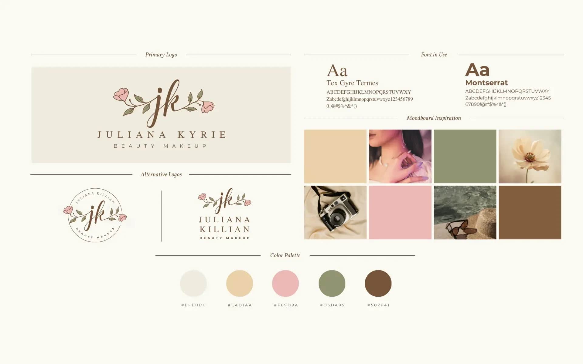
A mini brand guide is the core shared by both documents above, written down on a few pages. The list below is our own distillation of what recurs in published guidelines, cut down to the scale of a one-person or a few-person business:
- The primary mark, with a note of what it's built from: symbol, name treatment, and the typeface the name treatment is based on.
- Variants: a simplified or short version if one exists; colour and monochrome; positive and negative.
- Clear space, defined relative to the mark itself, with a diagram.
- Minimum size in millimetres for print and pixels for screen if you have one, with a note of which variant applies below that size, and whether you're measuring width or height.
- Colours in HEX and RGB for screen, and CMYK for print; a Pantone reference if you print in a special colour.
- Backgrounds: the logo on the backgrounds you actually use, and examples of backgrounds that are off-limits.
- Typography: a brand typeface with its weights, an office typeface, and a substitute for computers that don't have the brand typeface installed.
- Prohibitions, shown with examples: changing colour, proportions or layout, rotating, shadows, frames, text inside the clear space.
- Carrier templates you actually use: email signature, an offer or presentation template, a business card, a social-media avatar.
- A file list: which files exist, in what formats, and where they're kept.
The second half of a mini brand guide is upkeep, which in a small business usually has no one actually owning it by default. Write down, in the guide itself, who holds the source files and who approves an exception — a partner using your logo on their own material, for instance. Note a version number and a date too. Without one, after a year nobody knows which file is the one that's current.
Order matters as well. Guidelines describe a brand that already knows who it's talking to. If you haven't settled that yet, start with business model and target audience. Where the brand sits in a new business's buying order is shown in our guide to technology for a new business.
A mark is also rights
Brand guidelines describe how to use a logo, but they don't settle who owns the rights to it. That's a separate question, covered in full in logo design: what has to be in the contract with a designer, what you get from a Canva logo or an AI generator, and what registering a trade mark costs.
If you're commissioning a corporate-design system from a designer, hand them the checklist above in the brief as the scope of work. How to write a brief so the person doing the work doesn't have to guess is in the project brief.
FAQ
Frequently asked questions about brand guidelines and corporate design
It's the set of rules a business uses for its logo, colours, typefaces and document templates, so that all its material looks like parts of the same thing. The European Commission describes the purpose as giving a "recognisable image and a unified voice" to communications. The logo itself is only one element of the system.
Both published documents we compare — the Swiss Federal Administration's CD Bund manual and the European Commission's guidelines — repeat logo variants, a clear space and a list of prohibited uses. The Swiss manual also gives minimum sizes in millimetres, colours recorded for screen and print, and typeface rules. A fuller system adds templates for actual carriers, from a business card to an email signature and a presentation template.
Corporate design is the set of related rules; brand guidelines are the document that writes them down. Naming isn't standardised — some organisations call theirs a manual, others guidelines — and what each one actually contains varies more than the name suggests. When commissioning one, specify the scope by content, not by name.
Record every colour in more than one system: HEX and RGB for screen, CMYK for four-colour print, and a Pantone reference if the colour has to be identical across different print shops. The Swiss federal manual, for instance, records its red in all four systems at once. Add background rules too: a logo needs defined contrast, or a protective border, against any background it might sit on.
Usually not. A mini brand guide is enough: the mark and its variants, clear space, minimum size, colours in HEX, RGB and CMYK, a brand typeface and an office typeface, prohibitions, templates for the carriers you actually use, and a file list. Add a note of who holds the files and who approves exceptions, and mark a version number and date, because the guide will need updating.
Want to put your business's corporate design in order?
We'll help you write a mini brand guide: logo variants, colours for screen and print, typefaces and the carrier templates your business actually uses.
Related Posts
- Technology for a new business — what to buy in week zero, and what can wait
What to buy when starting a business in Switzerland: domain, mail, invoicing, CRM, office suite, brand — with sources.
- 1.Logo design for a business — copyright, trade marks, and the files you need
Logo design in Switzerland: the designer contract, whether a Canva or AI logo is yours, what a trade mark costs at the IPI, and the files you need.
- 2.Sole proprietorship in Switzerland: what AHV, VAT and the commercial register cost in 2026
Sole proprietorship Switzerland costs: AHV/IV/EO contribution rates for 2026, the VAT exemption and the commercial register, with two worked examples.
- 3.QR-bill and invoicing software in 2026 — what a Swiss invoice must contain
What a Swiss invoice must contain, the QR-bill timeline, and free versus paid invoicing tools, with a vendor-neutral data checklist.
- 4.Google Workspace pricing vs Microsoft 365 — plans and what you get in a small business
Google Workspace pricing from CHF 7 per user a month, Microsoft 365 Business Basic from CHF 5.67. Plans, storage, meetings and AI compared in Swiss francs.
- 5.Business Model Canvas — what it is, and how to map yours on one page before you start a business in Switzerland
Business Model Canvas in nine fields, Lean Canvas, the Value Proposition Canvas, persona and competitor analysis — straight from the tools' own authors.
- 6.Business email — what a mailbox on your domain costs, and how to set it up
Business email on your own domain from under a franc to about CHF 8.40 a month. Where to host a mailbox, and the SPF, DKIM and DMARC records Gmail requires.
- 1.
About the Author
Konrad Barejko
Your Business Partner, CEO
Experienced technology leader and entrepreneur with over 20 years of experience in the IT industry. Specializes in digital transformation, software product development and building engineering teams. For nearly 15 years, he led B2B teams at a global technology corporation, managing a 40-person team of developers and engineers, multi-million dollar budgets and products deployed at the scale of tens of millions of licenses in EMEA and global markets. Today, as the founder of his own consulting firm, he helps small and medium-sized businesses make smart technology decisions - from website and online store development, to process automation, to comprehensive IT consulting. He combines strategic thinking with a hands-on technical background in web development, DevOps and software architecture. He focuses on a collaborative culture, agile methodologies and solutions that realistically support business growth.